Enter your text here...

Graphic Domain

Graphic creation is my main service. the related skills are the ones I learnt first. I gradually reached a professional level while being the main graphist for the French brand Manga Café since 2010.

As a result, my style is influenced by - but not limited to - the Japanese imagery, be it traditional or modern.

Whatever the theme, my graphic works are built based on any size or format:

  • Paper : Posters, flyers, bookmarks, cards, stickers... 
  • Large sized POS advertising : Kakemonos, tarps, window stickers...
  • Branding and graphic frameworks : Logos, documents...

Each support and project is unique and custom-made following your needs. Contact me to discuss it !

Graphic Portfolio

This portfolio is divided in 2 categories: first, a selection of my favorite works completed for Manga Café, my main partner for more than 10 years. Second, a presentation of the works done for other clients.

1

Tarps and Kakemonos

Collection of tarps to decorate festival booths.

  • In regards to the "Manga Café Konbini" label which offers japanese snacks and traditional objects, the tarps concept has been developped following the image of old japanese stalls with wooden textures and authentic patterns.
  • As for the "Mangas" booth, a pop concept has been favored, with an imagery fitting the format. The rich diversity of themes treated in these comics has been put to the forefront, with a monochrome color code and some works around screentones, as core visual cues.

Kakemono (vertical displays)

and various stickers

2

Posters for events

3

Bookmarks

Collection of bookmarks created in collaboration with the French manga editor Kaze Manga, on the best-seller series : "The Promised Neverland" by Kaiu Shirai and Posuka Demizu.

4

Company brochure

Inside

Outside

5

SNS games visuals

A small selection of visuals created for small competitions on social media.

6

Tote bag

Vectorial visuals created for tote bags and inspired by japanese traditional textile patterns.

7

Création de labels et identité graphique

A restaurant brand specialized in japanese curry.

Le logo applique à la lettre le nom de la marque, et est accompagné d'une déclinaison d'accompagnements amusants.


A restaurant brand specialized in Japanese-flavoured Ice cream.

The logo is inspired by the vintage neon image the ice cream has in the USA, a legacy from the 50's.


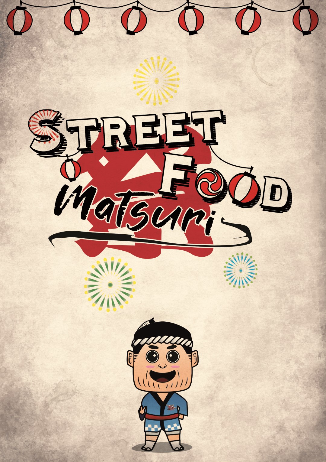
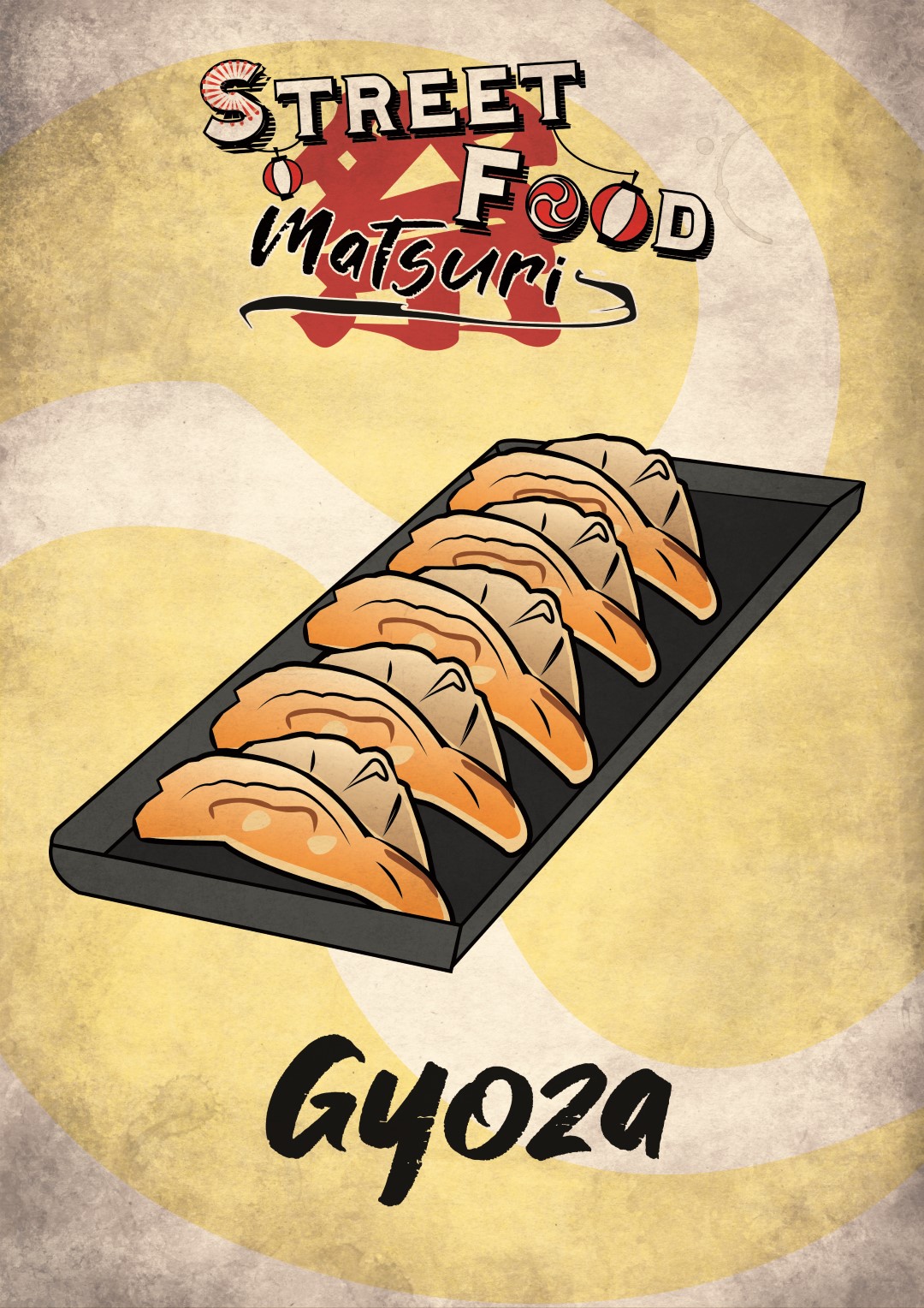
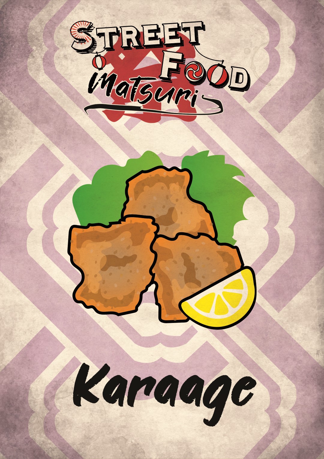
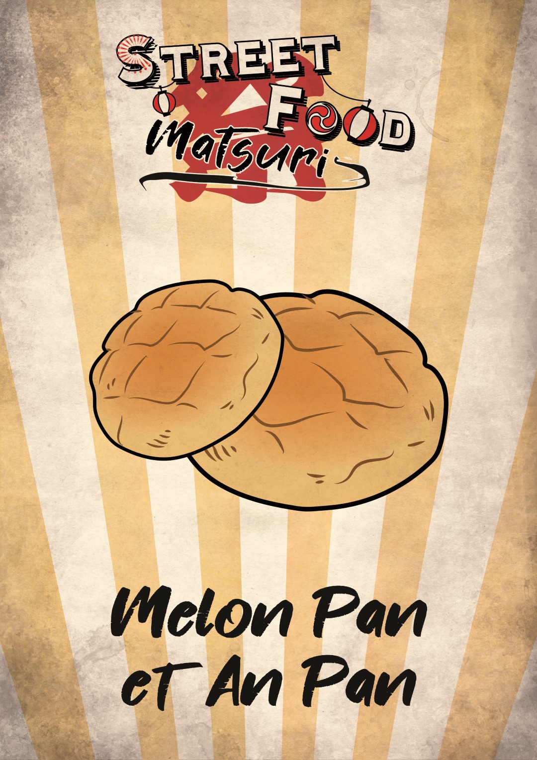
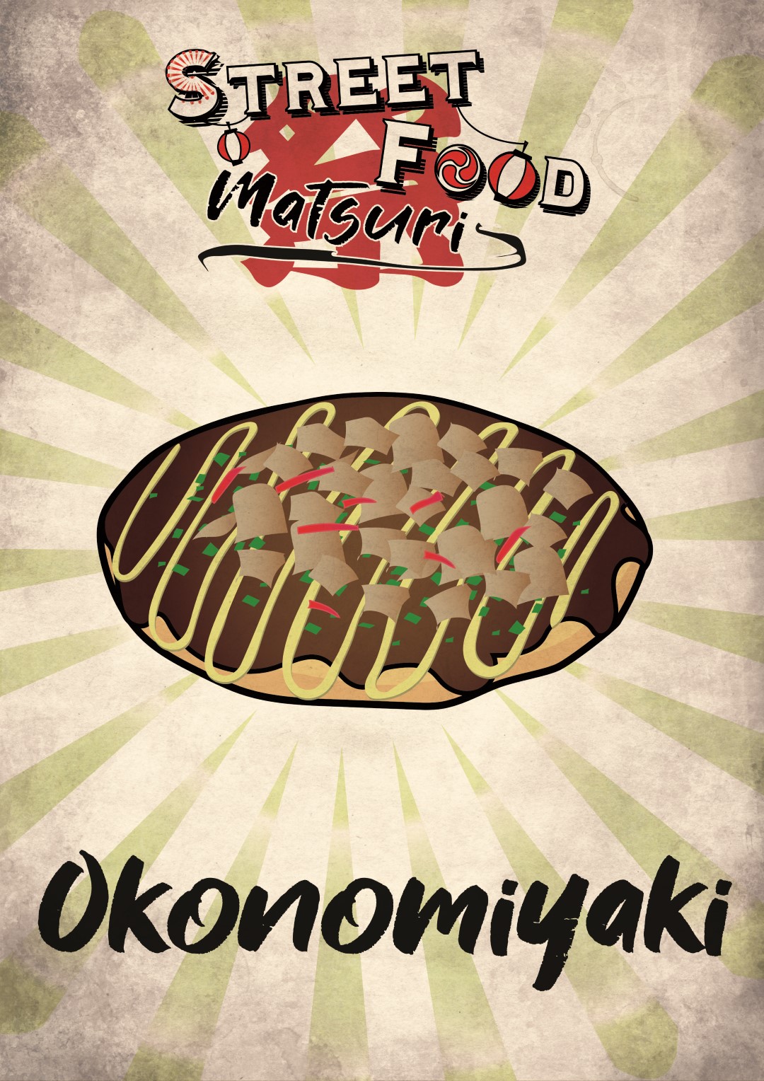
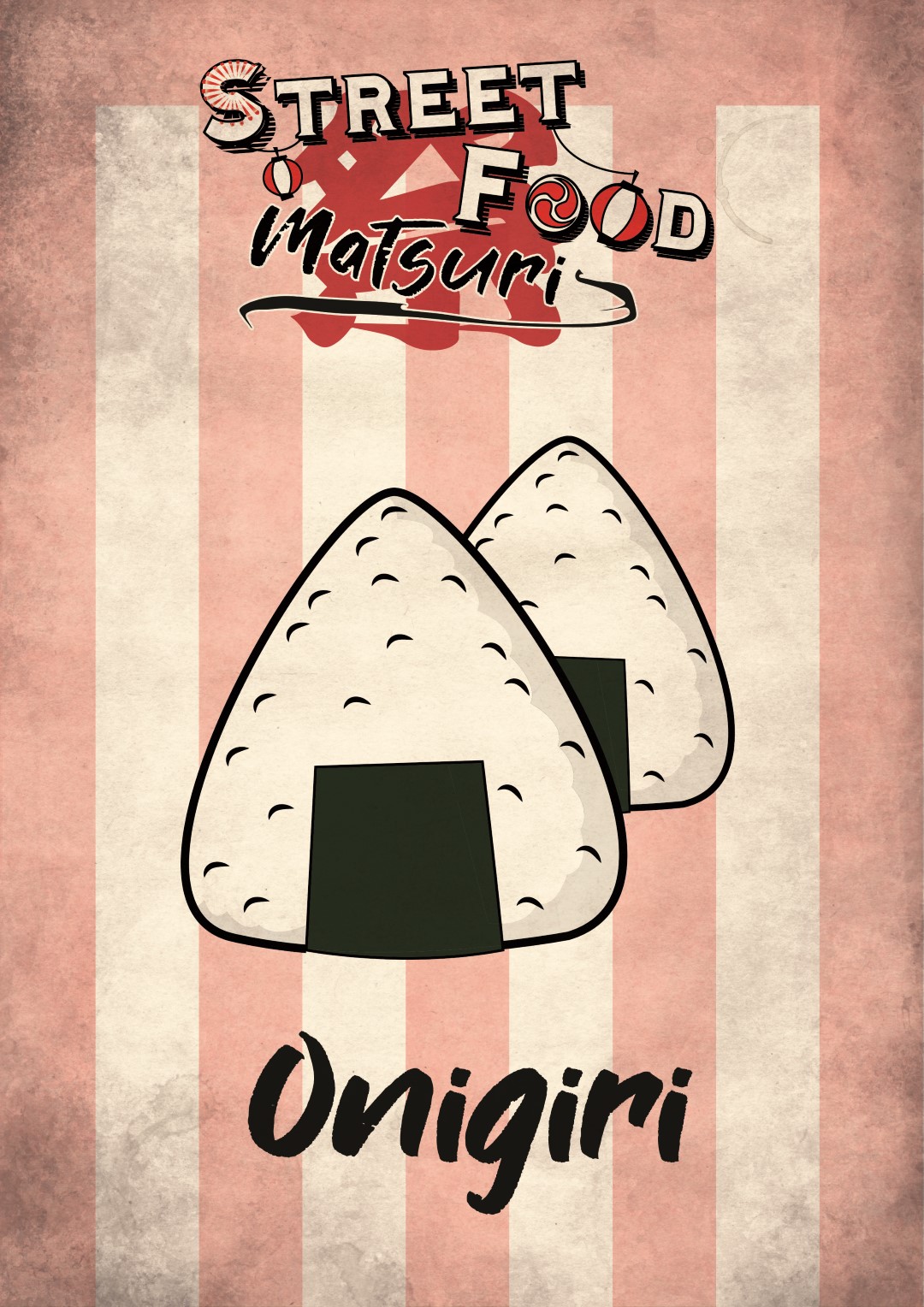
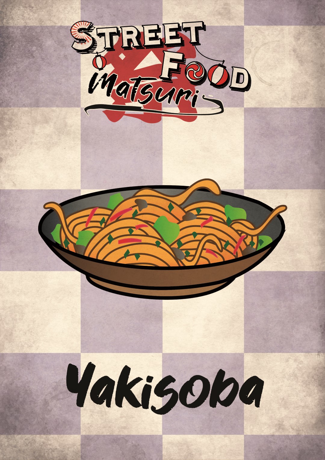
A restaurant brand which offers a selection of typically japanese street food dishes.

The branding has been built around the imagery of this street food culture which is still very vivid in Japan, especially during festivals. All of this mixed with a "retro-grungy" filter brings us back straight to the nostalgic Showa era (1926-1989).

The custom-drawn dish imagery can also be noticed, as well as the very expressive mascot Jiji Matsuri - "festival's uncle" !

AND OTHERS

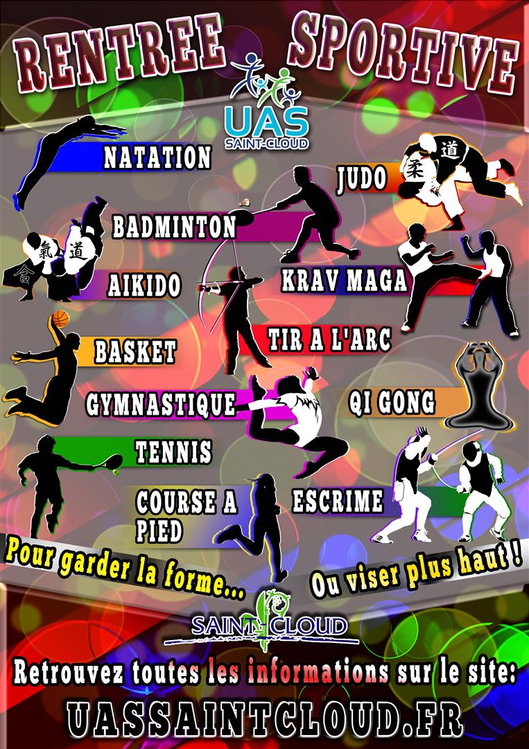
L'Union Associative et Sportive de Saint-Cloud (The Associative and Sportive Union of Saint-Cloud) manages all the sport clubs of the city. I worked with them for 2 consecutive years and created their collection of posters promoting each club.

I also worked for them on a couple of side projects, such as Greetings Cards or a Multi-sports training poster. 

Affiche Stage Multisport UAS

Other works :

  • My entry to a poster creation contest for the 13th Cognitive Sciences Academic Forum : A project which differs from my usual creations. I chose to shed light on the fact that the eyes communicate most felt emotions and project Intelligence. This concept is completed by a metaphoric background melting the multiplicity of neuronal networks into the infinity of Space.
  • Logo Shima Hotel, created for the opening of a small hotel on Yoron Island in Japan.

FURANOWA: A Japanese company based in Tokyo, specialized in the production, weaving and sales of artisanal organic cotton.

I worked with them for the creation of a paper catalog, with photoshoot of their products beforehand.

This catalog is a unique piece in my portfolio, as it is the result of a combined process of document formatting, layout, graphic creation and product photography.

It is aimed mostly for a mature female audience. Therefore, the specifications were conservative with, for example, an imposed character font.


Let's work together !

For any demand, contact me directly via the following mail adress :
kevin@oshino-studio.com

Or contact me through the following form :

The amount of personal information required for filling this contact form is the bare minimum I need to properly answer and communicate with you properly. the data is stored in my mail box and is used only in the purpose of communicating with you. It is stored for 3 years and I will not communicate them to any third party unless having your prior agreement to do so, nor sell them in any way. As per the french law "informatique et libertés" on the management of private information online, you have the right to access and modify your stored personal data by requesting it using the following e-mail adress: kevin@oshino-studio.com